 This is the layout of my digipack with the final images on and arranged in the way that they would be on my actual digipack. I chose to substitute actual images in for plain backgrounds with the artist name and track name on and i believe that the final outcome has proved that the decision was the right one. I think i has the right effect and follows the colour scheme through and therefore makes it a recognisable product. I also decided to have the first inside cover as i plain background with the letter 'F' on, to signify 'Finn' the album artist. This is wrote in a scripted style font and therefore creates a contrast with the front cover and the font on the poster. This, however, is conventional of pop punk album's as it creates contrast, for example, on the Good Charlotte - The Chronicles Of Life And Death, there were two very different styles on font on the front cover which connotes that you shouldn't judge people by how they look as, for the most part, they are a different person to what is perceived. Linking with this idea is the choice to have placed an image of a tub of pills against the image of the model on the front biting a pill. This creates contrast further and shows that despite looking in control and confident on the front (the model is biting the pill and therefore not letting it get the better of her as she is shown looking fierce and dominant), inside people feel troubled and have to resort to a lot of different drugs to help them get through. This is also a strong theme throughout pop punk music and therefore, felt it was relevant to my digipack.
Wednesday, 16 March 2011
Digipack Design
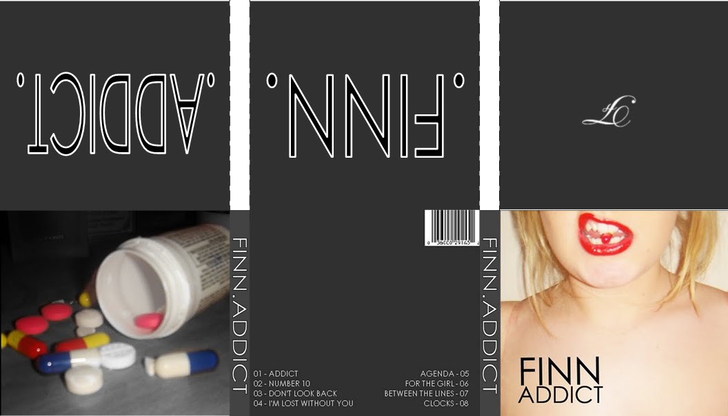
This is the layout of my digipack with the final images on and arranged in the way that they would be on my actual digipack. I chose to substitute actual images in for plain backgrounds with the artist name and track name on and i believe that the final outcome has proved that the decision was the right one. I think i has the right effect and follows the colour scheme through and therefore makes it a recognisable product. I also decided to have the first inside cover as i plain background with the letter 'F' on, to signify 'Finn' the album artist. This is wrote in a scripted style font and therefore creates a contrast with the front cover and the font on the poster. This, however, is conventional of pop punk album's as it creates contrast, for example, on the Good Charlotte - The Chronicles Of Life And Death, there were two very different styles on font on the front cover which connotes that you shouldn't judge people by how they look as, for the most part, they are a different person to what is perceived. Linking with this idea is the choice to have placed an image of a tub of pills against the image of the model on the front biting a pill. This creates contrast further and shows that despite looking in control and confident on the front (the model is biting the pill and therefore not letting it get the better of her as she is shown looking fierce and dominant), inside people feel troubled and have to resort to a lot of different drugs to help them get through. This is also a strong theme throughout pop punk music and therefore, felt it was relevant to my digipack.
Subscribe to:
Post Comments (Atom)
No comments:
Post a Comment