
Monday, 21 March 2011
Saturday, 19 March 2011

Friday, 18 March 2011
Audience Feedback Questionnaire
How old are you?
Under 17
18-25
26-32
22-45
46+
What is your gender?
Male
Female
What do you think if the genre of my music video?
Pop
Rap
R'n'B
Punk
Indie
Heavy Metal
Other
Do you understand the narrative of my music video?
Yes
No
How did the music video make you feel?
Can you see the conventional techniques used in existing music videos in my own?
Yes
No
On a scale of 1-5, one being the least and 5 being the most, how well are these conventions used?
1 2 3 4 5
What would you have like to have seen more of in my music video?
Performance
Variety of shots
Different narrative structure
Other
On a scale of 1-5, 1 being the least and 5 being the most, how well do you think my product sticks to the target genre?
1 2 3 4 5
How could my music video be improved?
On a scale of 1-5, 1 being the least and 5 being the most, how effective is my digipak/advertisment package?
1 2 3 4 5
Can you see the link between the music video and digipak/advertisment?
Yes
No
If so, on a scale of 1-5, 1 being the least and 5 being the most, how effective is this link?
1 2 3 4 5
What is your favourite part of my promotional package (video, digipak, advertisment)?
What would be the one thing you would change about my promotional package?
Thursday, 17 March 2011
Final Disk Design (CD/DVD)
CD DVD
DVD

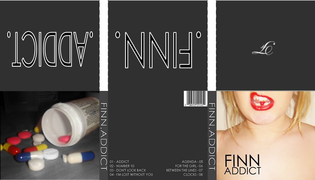
DVDThese are the designs for my CD and DVD for my digipak. I chose to have both discs following the same style, for example both have the artist name in a large, clear font at the top of the disc with the album name underneath. I then chose to have the tracks arcing around the top and bottom of the disc. This allows the audience to know what tracks are on the disc and with the DVD (live footage from a tour and backstage footage) allows them to know what songs were performed on that tour and in what order. This creates an easy accessible navigation for the audience so they can pick and chose what songs to listen to with ease. Also placed on the CD is the artist's website where the audience are able to find out more information about them and weekly news etc.
A copyright notice has also been added, as this is a convention that runs throughout existing CD's and DVD's and therefore helps to create a realistic product.
I also decided to alter the colours slightly on each disc as this allows them to be distinguished from each other whilst still looking part of the same package. This is also a spotted convention of digipak’s and CD/DVD packages.
The CD will cover the inside cover of my digipak with the text, 'FINN' on whereas the DVD will cover the 'ADDICT' cover of my digipak.
Wednesday, 16 March 2011
Digipack Design
 This is the layout of my digipack with the final images on and arranged in the way that they would be on my actual digipack. I chose to substitute actual images in for plain backgrounds with the artist name and track name on and i believe that the final outcome has proved that the decision was the right one. I think i has the right effect and follows the colour scheme through and therefore makes it a recognisable product. I also decided to have the first inside cover as i plain background with the letter 'F' on, to signify 'Finn' the album artist. This is wrote in a scripted style font and therefore creates a contrast with the front cover and the font on the poster. This, however, is conventional of pop punk album's as it creates contrast, for example, on the Good Charlotte - The Chronicles Of Life And Death, there were two very different styles on font on the front cover which connotes that you shouldn't judge people by how they look as, for the most part, they are a different person to what is perceived. Linking with this idea is the choice to have placed an image of a tub of pills against the image of the model on the front biting a pill. This creates contrast further and shows that despite looking in control and confident on the front (the model is biting the pill and therefore not letting it get the better of her as she is shown looking fierce and dominant), inside people feel troubled and have to resort to a lot of different drugs to help them get through. This is also a strong theme throughout pop punk music and therefore, felt it was relevant to my digipack.
Digipack Final Images #2
Front Cover

Inside Cover #1 Inside Cover #2
 Inside Cover #3
 Inside Cover #4
 Inside Cover #2Inside Cover #3 Inside Cover #4
 Back Cover Spine
Spine
SpineTuesday, 15 March 2011
Digipack Final Images #1
Front Cover Inside Cover #1
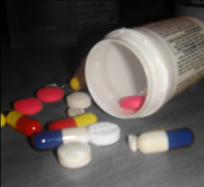
Inside Cover #2
Inside Cover #3
Back Cover
Spine

CD/DVD Inside Cover #1
Inside Cover #2
Inside Cover #3
Back Cover
Spine


These were the images i origionally planned to use throughout my digipack, however, after putting it together and drafting out the layout i realised that it was too much and therefore, made the decision to discard the images of the ash tray and bottle of vodka in replacement for a plain background with the artist name and song title on. These images will be placed behind where the CD and DVD will go, and therefore has the right effect as there is not too much there, however, still enough so the space is not blank whilst still linking the digipack with the arist and track. However, i chose to keep the spine the same as i believe it is simple, yet effect and includes everything that needs to be included in the right way (artist name and track title in a bold, recognisable font) and also the front cover and the inside cover #1, however i will place this is a different place on my digipack.
Thursday, 10 March 2011
Poster Final Draft

When designing my poster i decided to change the background to black and white, however, keep the lip area in colour as it creates a strong contrast between the two things and links with the pop punk genre, whilst still being conventional of pop punk products. The connotations are to do with things not being all they seem and people having a contrast between who people think you are and who you actually are. This also links with the music of the pop punk genre as the sound is a predominant pop sound with guitar rifts, creating the punk element of the music.
Friday, 4 March 2011
Music Video First Draft
This is the first draft of my music video to the song 'I'm Lost Without You' by the band 'Blink-182'. I plan to add some of my shots to include a variety of camera angles. I also plan to re shoot some existing shots where the girl's are together to make sure that the message that they are now happy is portrayed clearly. I will also shoot some existing shots in different locations to make sure that it is clear that the girls are willing to have a good time now and are happy with their situation and cut them into some of the verses so the video does not become monotonous and the audience do not become bored. This will also include adding more of a narrative structure. I also plan to have my video in black and white.
Ideas for Artist Name
When designing my digipak and poster i had to decide on a name for my artist that would fit in with the theme of my song and poster/digipak design. I wanted a band name that had connotations of strength and fighting, but that was only a one word name. After researching name origins i came up with the name 'Finn' as the name had a meaning of strength and being a warrior. This links with the theme of my digipak and photo as the connotations are to do with struggling with something.
Poster First Print Draft

This is my first draft of my poster that is advertising my CD. I chose to feature an image similar to the one used on my digipack in order to create a recognisable product and a direct link between the two.
I chose to place the text at the bottom of the poster, in a large and clear font, making it easy for the audience to see and read.
Underneath this, in smaller text, are the details about what the CD/DVD includes and in the bottom right when it is released (out now).
I plan to change to background colours on the poster as i believe it will create a stronger image and link more with the digipack. I plan to put the image in black and white, however keep the motuh and the pill in colour. This links with the connotations that are running through the digipak (that there are two sides to everything and even though things might look okay, sometimes they are not. It also shows how addiction can get worse and progress into something serious. This is shown through the black and white being the negative and the colour being the positive's of the situation. As the image will be predominantly black and white it shows that this situation is mostly negative and is washing away the positive's) and therefore creates a strong link between the two and becomes a recognisable product for the audience.
When designing the text i chose to stick with conventional pop punk styles and do the text in black, white and red. I chose to feature the majority of the text in black as it is a strong colour and would stand out easily against the background. However i chose to outline the text in white (artist name) and red (digipack title) to help it stand out further whilst also making it recognisable as a pop punk product. The choice to outline the artist name in one colour and the digipack title in another was made as it simply helps the audience distinguish between what's the artist name and what's the CD title.
Thursday, 3 March 2011
Digipak Chosen Images
Front Cover


Inside Cover #2
Inside Cover #3
Inside Cover #4 will be plain black. This is connote death and the darkness that the drugs have had upon the girl's body and life.
(click images to enlarge)

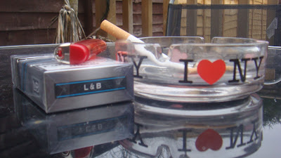
Poster Unused Images


I chose to use the same style of image that is on my front cover, on my poster, creating a link between the two and making it evident that the two are linked. I decided to also create a further link by, when editing my images, having the whole image in black and white, apart from the mouth area, where the stronger colours are, i.e the red lips and the red and yellow of the pill.
Similar to the front cover of my digipak, once i had taken these images i realised that there was not much space for text to be featured, therefore i re-took the images, framing it so more of the chest area was in shot, enabling me to place the text on a bare canvas.
I chose to have the image of the girl biting the pill as appose to the one where it is simply on her tongue as i believe that it shows more power, whereas with it just laying on her tongue connotes a greater vulnerability and this was not the message that i wanted to portray. The imagery behind my poster runs parallel with that of the front cover of my digipak in that, at first the girl is in control of the drugs she's taking and it is just for leisure use; nothing serious.
As the poster is advertising the digipak, it creates a strong link between the two without giving too much away about what the album is about and the other side's to it i.e the addiction getting worse (connoting that the album has more than one sound to it, and that the more you listen to it, the more addicted you will become)
(click image to enlarge)
Wednesday, 2 March 2011
Digipak unused Images - Inside Cover #3


The final image I have used on my digipak is also going to be in black and white. This contrasts with the use of colour on the front cover, connoting the idea of contrast between who people think you are and who you are, even more. The idea that the actual model is in colour, and the things that are causing the addiction are in black and white show that the person is stronger that the things that are causing a downward spiral in her life. Once again, the location is different, showing that the addiction is at it's peak and has progressed into seriousness. As there are other butts in the ash tray, it links with the idea that the addiction has become worse. As the angle of the image is straight on it connotes that the girl is looking it straight in the eye, linking with the idea that she is at the peak of it.
Reasons for not choosing to use these images in my final digipak were similar to previous. Mainly, once again the predominant reason being the use of angle. One again, i used a high angle in some shots to make it clear to the audience what was in the frame, however, after taking this from a low angle, i saw that the audience were still able to tell and figure out what was in the frame and what it meant. Like previous, the use of a high angle shot did not connote the message i wanted to, as at this point the connotations are saying that the girl now has no control with her addiction what so ever, the drugs are ruling her and have taken over her life.
(click images to enlarge)
Digipak unused Images - Inside Cover #2


These images will also be in black and white, adding to the mysterious element. As the liquid is poured into the glass already and the bottle is half empty it shows that her addiction is still quite strong, progressively getting stronger, although, the bottle is not empty, therefore it shows that it is not 100% taken over the girl. The idea that the image has been shot in a different location to the previous shows, further, that the addiction is progressing and slowly getting worse. The use of the low angle shot shows that the drink is taking over her, and she sees it as something that she fears.
I chose to discard these images from my final selection as, once again, i thought the framing and angles were not right/suitable for the message i was trying to convey. For example, some shots
were taken from a high angle, connoting that the girl is still totally in control of her drug taking, however, the message i wanted to put across was that, the more drugs you take, and the more frequently, you are slowly going to become obsessed, the drugs will began to rule you and you will find yourself depending on them. Therefore, i thought the connotations of using a high angle shot did not reflect this. Also, on some of the images, the photo did not show the full use of props and therefore it was hard to tell what was in the frame. This is another reason why i decided not to use some of my images.
(click images to enlarge)
Subscribe to:
Comments (Atom)