Monday, 31 January 2011

Ancillary Text Analysis #3 (Poster)


The third poster i have chose to analyse is Madonna's Celebration, a collection of her greatest hits. The image featured on the front is a close up of Madonna's face, enabling the audience to have a clear view of the artist. The image used is one that was famous when Madonna was at her peak in music, connoting that the music featured will be the great hits that were realsed around the same time as the image. The image is also featued in a pop art style, which connotes a 60's vibe, also linking with the idea that the music on the album will predominantly from that era.

The name of the artist (Madonna) and the name of the CD title (Celebration) is featured along the top of the poster, ensuring that the audience are immediately drawn to this part of the poster. The idea that the CD is called 'Celebration' connotes that Madonna is celebrating her success over the years and wanting to share it with he fans by putting all the great songs on one album.

Wednesday, 19 January 2011

Ancillary Text Analysis #2 (Poster)


The second poster/advert i chose to analyse was Gwen Stefani's Love.Angel.Music.Baby.
Taking up the majority of the frame is the artist. This is taken from a low angle shot making the artist look superior to the audience and as though she is a leader. This links with the theme of the poster which has connotations of being royal. We can tell this from the costume and setting as Gwen Stefani is holding a crown and is sat on a throne. She is also wearing fur which connotes wealth.
The font style also connotes royalty as it is in gold and also in an old english font. This connotes that the album is timeless and features timeless music that everyone can enjoy. This is featured in a large font across the centre of the poster, therefore making it stand out against the image and ensuring that the audience can see it clearly and are instantly aware of who the artist is.
Featured underneath this is the title of the album that the poster is advertising. This is placed in a smaller font, however in the same style, creating a recognisable link. Despite it being featured in a smaller font it is clear what the album is as, a smaller image of the album is placed next to this in the bottom left corner. Similar to the Green Day poster, the image used on the poster is the same one that's used on the CD, creating a link and making it a recognisable product.

Tracks that are featured on the album and that have already been released are also featured underneath this text. This lets the audience know what is featured on the album and also, helps persuade them to buy it because if a track that has already been released and that the audience like is on the album, it will make them think that other tracks that they will like could also be on the album.

The record company that Gwen Stefani is under, the album release date and Gwen Stefani's website is also featured along the bottom of the poster, giving the audience greater detail into the artist.

Monday, 10 January 2011

Ancillary Text Analysis #1 (Poster)

The first poster/advert i have analysed is Green Day's American Idiot. This poster features the same image and colour scheme as the one on the album, therefore, creating a link between the two and making it a recognisable product.
The colour scheme is, red, black and white, connoting predominant darkness and danger with elements of light.
The band name is featured in the top left of the frame, ensuring it is clearly seen by the audience and they instantly know who the product is advertising. The name of the album that the poster is selling is featured under it in a smaller, font. However, this text is in a different colour, ensuring that it still stands out.
The image to the right hand side of the frame, is in a cartoon style. The colours used in the image follow the colour scheme of the full advert, making it a recognisable still.
As the genre of Green Day's music is punk, therefore has element similar to the conventions of the pop punk genre and the products for these bands. Therefore, the artist of the track is not featured on the CD or the poster. This is a convention i plan to follow when designing and making my poster and digipak.
A small image of the label that the band are signed to is also placed in the bottom corner.

Tuesday, 4 January 2011

Digipak Design Draft


Once i had designed the drafts for my digipack i planned out my choice of images and the theme i wanted to run through my digipack. I chose the theme of addiction with an underlying theme of vanity. I chose to feature only one image of a person as i noticed that running through existing pop punk digipacks did not feature images of people. This image will feature on the front cover and also on each disk.


I then chose to feature images of pills, alcohol and a lighter on the other covers of my digipack which links with the ideas of addiction and also the pain that people will go through to look and be the person they want to be.

Friday, 17 December 2010

Digipak Design Sketch Draft


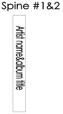
Before completing the design for my digipak i first decided to draft out the placement of each image and text on the design. I decided that on the front cover i would have one single image taking up the whole of the cover. I then decided that i would have the band name in the top right of the cover and the album name in the bottom left, however this would be in a larger font to ensure that the audience still see it. I decided that i would have both spine's the same and have the band name and album title along the side, next to each other in the same font used on the front cover. I also decided the keep the back cover quite plane, to ensure the album tracks stand out clearly. I decided the place them along the bottom of the page in a bold font.

Within the inside cover i decided to include a pocket where the booklet (containing song lyrics, thank you's etc.) will go. I also decided to place an image in the middle of the cover. This image, as well as all other images used, will keep with the theme of the album. The second inside cover, i decided, would be similar to the first by having an image in the centre of the cover, however the image will be a different one. The third insde cover will also be the same. I also decided to design a layout for the CD/DVD and the space behind each. I decided that behind the CD i would feature the artist name, however the space behind the DVD will remain blank.

I decided to use the same image on the CD and DVD that i have done on the front of the cover, creating a distinguishable link between the two, however on the DVD the colours will be inverted to ensure the audience know which is which.

Tuesday, 14 December 2010

Digipack Design/Template


This is a 6 panel digipack, 2 CD template that will be used when planning and producing my own digipack. The design includes a front and back cover, two spines, the left inside cover and two sides for disks that will need to be planned and produced along with the designs for both the CD and DVD included.