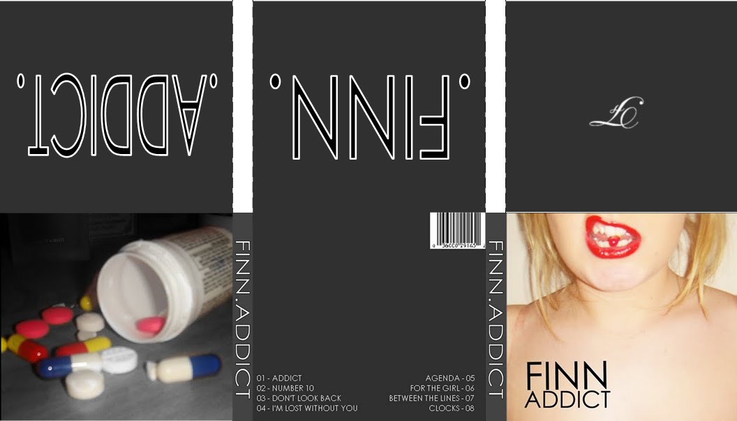
 This is the layout of my digipack with the final images on and arranged in the way that they would be on my actual digipack. I chose to substitute actual images in for plain backgrounds with the artist name and track name on and i believe that the final outcome has proved that the decision was the right one. I think i has the right effect and follows the colour scheme through and therefore makes it a recognisable product. I also decided to have the first inside cover as i plain background with the letter 'F' on, to signify 'Finn' the album artist. This is wrote in a scripted style font and therefore creates a contrast with the front cover and the font on the poster. This, however, is conventional of pop punk album's as it creates contrast, for example, on the Good Charlotte - The Chronicles Of Life And Death, there were two very different styles on font on the front cover which connotes that you shouldn't judge people by how they look as, for the most part, they are a different person to what is perceived. Linking with this idea is the choice to have placed an image of a tub of pills against the image of the model on the front biting a pill. This creates contrast further and shows that despite looking in control and confident on the front (the model is biting the pill and therefore not letting it get the better of her as she is shown looking fierce and dominant), inside people feel troubled and have to resort to a lot of different drugs to help them get through. This is also a strong theme throughout pop punk music and therefore, felt it was relevant to my digipack.
Wednesday, 16 March 2011
Digipack Design
This is the layout of my digipack with the final images on and arranged in the way that they would be on my actual digipack. I chose to substitute actual images in for plain backgrounds with the artist name and track name on and i believe that the final outcome has proved that the decision was the right one. I think i has the right effect and follows the colour scheme through and therefore makes it a recognisable product. I also decided to have the first inside cover as i plain background with the letter 'F' on, to signify 'Finn' the album artist. This is wrote in a scripted style font and therefore creates a contrast with the front cover and the font on the poster. This, however, is conventional of pop punk album's as it creates contrast, for example, on the Good Charlotte - The Chronicles Of Life And Death, there were two very different styles on font on the front cover which connotes that you shouldn't judge people by how they look as, for the most part, they are a different person to what is perceived. Linking with this idea is the choice to have placed an image of a tub of pills against the image of the model on the front biting a pill. This creates contrast further and shows that despite looking in control and confident on the front (the model is biting the pill and therefore not letting it get the better of her as she is shown looking fierce and dominant), inside people feel troubled and have to resort to a lot of different drugs to help them get through. This is also a strong theme throughout pop punk music and therefore, felt it was relevant to my digipack.Digipack Final Images #2
Front Cover

Inside Cover #1 Inside Cover #2
 Inside Cover #3
 Inside Cover #4
 Inside Cover #2Inside Cover #3 Inside Cover #4
 Back Cover Spine
Spine
SpineTuesday, 15 March 2011
Digipack Final Images #1
Front Cover Inside Cover #1
Inside Cover #2
Inside Cover #3
Back Cover
Spine

CD/DVD Inside Cover #1
Inside Cover #2
Inside Cover #3
Back Cover
Spine


These were the images i origionally planned to use throughout my digipack, however, after putting it together and drafting out the layout i realised that it was too much and therefore, made the decision to discard the images of the ash tray and bottle of vodka in replacement for a plain background with the artist name and song title on. These images will be placed behind where the CD and DVD will go, and therefore has the right effect as there is not too much there, however, still enough so the space is not blank whilst still linking the digipack with the arist and track. However, i chose to keep the spine the same as i believe it is simple, yet effect and includes everything that needs to be included in the right way (artist name and track title in a bold, recognisable font) and also the front cover and the inside cover #1, however i will place this is a different place on my digipack.
Thursday, 10 March 2011
Poster Final Draft

When designing my poster i decided to change the background to black and white, however, keep the lip area in colour as it creates a strong contrast between the two things and links with the pop punk genre, whilst still being conventional of pop punk products. The connotations are to do with things not being all they seem and people having a contrast between who people think you are and who you actually are. This also links with the music of the pop punk genre as the sound is a predominant pop sound with guitar rifts, creating the punk element of the music.
Friday, 4 March 2011
Music Video First Draft
This is the first draft of my music video to the song 'I'm Lost Without You' by the band 'Blink-182'. I plan to add some of my shots to include a variety of camera angles. I also plan to re shoot some existing shots where the girl's are together to make sure that the message that they are now happy is portrayed clearly. I will also shoot some existing shots in different locations to make sure that it is clear that the girls are willing to have a good time now and are happy with their situation and cut them into some of the verses so the video does not become monotonous and the audience do not become bored. This will also include adding more of a narrative structure. I also plan to have my video in black and white.
Ideas for Artist Name
When designing my digipak and poster i had to decide on a name for my artist that would fit in with the theme of my song and poster/digipak design. I wanted a band name that had connotations of strength and fighting, but that was only a one word name. After researching name origins i came up with the name 'Finn' as the name had a meaning of strength and being a warrior. This links with the theme of my digipak and photo as the connotations are to do with struggling with something.
Poster First Print Draft

This is my first draft of my poster that is advertising my CD. I chose to feature an image similar to the one used on my digipack in order to create a recognisable product and a direct link between the two.
I chose to place the text at the bottom of the poster, in a large and clear font, making it easy for the audience to see and read.
Underneath this, in smaller text, are the details about what the CD/DVD includes and in the bottom right when it is released (out now).
I plan to change to background colours on the poster as i believe it will create a stronger image and link more with the digipack. I plan to put the image in black and white, however keep the motuh and the pill in colour. This links with the connotations that are running through the digipak (that there are two sides to everything and even though things might look okay, sometimes they are not. It also shows how addiction can get worse and progress into something serious. This is shown through the black and white being the negative and the colour being the positive's of the situation. As the image will be predominantly black and white it shows that this situation is mostly negative and is washing away the positive's) and therefore creates a strong link between the two and becomes a recognisable product for the audience.
When designing the text i chose to stick with conventional pop punk styles and do the text in black, white and red. I chose to feature the majority of the text in black as it is a strong colour and would stand out easily against the background. However i chose to outline the text in white (artist name) and red (digipack title) to help it stand out further whilst also making it recognisable as a pop punk product. The choice to outline the artist name in one colour and the digipack title in another was made as it simply helps the audience distinguish between what's the artist name and what's the CD title.
Subscribe to:
Posts (Atom)