Thursday, 3 March 2011

Digipak Chosen Images

Front Cover
Inside Cover #1

Inside Cover #2
Inside Cover #3
Inside Cover #4 will be plain black. This is connote death and the darkness that the drugs have had upon the girl's body and life.

(click images to enlarge)

Poster Chosen Image


(click image to enlarge)

Poster Unused Images

I chose to use the same style of image that is on my front cover, on my poster, creating a link between the two and making it evident that the two are linked. I decided to also create a further link by, when editing my images, having the whole image in black and white, apart from the mouth area, where the stronger colours are, i.e the red lips and the red and yellow of the pill.
Similar to the front cover of my digipak, once i had taken these images i realised that there was not much space for text to be featured, therefore i re-took the images, framing it so more of the chest area was in shot, enabling me to place the text on a bare canvas.

I chose to have the image of the girl biting the pill as appose to the one where it is simply on her tongue as i believe that it shows more power, whereas with it just laying on her tongue connotes a greater vulnerability and this was not the message that i wanted to portray. The imagery behind my poster runs parallel with that of the front cover of my digipak in that, at first the girl is in control of the drugs she's taking and it is just for leisure use; nothing serious.
As the poster is advertising the digipak, it creates a strong link between the two without giving too much away about what the album is about and the other side's to it i.e the addiction getting worse (connoting that the album has more than one sound to it, and that the more you listen to it, the more addicted you will become)

(click image to enlarge)

Wednesday, 2 March 2011

Digipak unused Images - Inside Cover #3

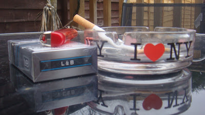
The final image I have used on my digipak is also going to be in black and white. This contrasts with the use of colour on the front cover, connoting the idea of contrast between who people think you are and who you are, even more. The idea that the actual model is in colour, and the things that are causing the addiction are in black and white show that the person is stronger that the things that are causing a downward spiral in her life. Once again, the location is different, showing that the addiction is at it's peak and has progressed into seriousness. As there are other butts in the ash tray, it links with the idea that the addiction has become worse. As the angle of the image is straight on it connotes that the girl is looking it straight in the eye, linking with the idea that she is at the peak of it.

Reasons for not choosing to use these images in my final digipak were similar to previous. Mainly, once again the predominant reason being the use of angle. One again, i used a high angle in some shots to make it clear to the audience what was in the frame, however, after taking this from a low angle, i saw that the audience were still able to tell and figure out what was in the frame and what it meant. Like previous, the use of a high angle shot did not connote the message i wanted to, as at this point the connotations are saying that the girl now has no control with her addiction what so ever, the drugs are ruling her and have taken over her life.

(click images to enlarge)

Digipak unused Images - Inside Cover #2

These images will also be in black and white, adding to the mysterious element. As the liquid is poured into the glass already and the bottle is half empty it shows that her addiction is still quite strong, progressively getting stronger, although, the bottle is not empty, therefore it shows that it is not 100% taken over the girl. The idea that the image has been shot in a different location to the previous shows, further, that the addiction is progressing and slowly getting worse. The use of the low angle shot shows that the drink is taking over her, and she sees it as something that she fears.

I chose to discard these images from my final selection as, once again, i thought the framing and angles were not right/suitable for the message i was trying to convey. For example, some shots
were taken from a high angle, connoting that the girl is still totally in control of her drug taking, however, the message i wanted to put across was that, the more drugs you take, and the more frequently, you are slowly going to become obsessed, the drugs will began to rule you and you will find yourself depending on them. Therefore, i thought the connotations of using a high angle shot did not reflect this. Also, on some of the images, the photo did not show the full use of props and therefore it was hard to tell what was in the frame. This is another reason why i decided not to use some of my images.

(click images to enlarge)

Sunday, 27 February 2011

Digipak unused Imags - Inside Cover #1

These images are the one's i have chose to feature on the first inside cover of my digipak. These images will be in black and white to link with the idea of mystery. The background of the images will also be edited to be out of focus, also linking with this idea. The idea that the images have been taken in a normal living environment, it also links with the contrast that, despite the addiction that someone has, they are stil normal people. The variety of pills used shows the strong addiction the girl featured on the cover has. However, the fact that they are still some pills in the container, shows that her addiction is not at it's strongest.

Although these images are similar to the one i have chosen to feature on my digipak i decided against using these and i thought the angle was not right and in some cases i felt the background took up too much of the frame. I believe the framing and the angle on the chosen shot connotes the addiction stage well. As the angle is slightly high it shows that the girl/character on the front takes these drugs but is not ruled by them. It shows that she is in charge of what drugs she takes and does them solely for leisure purposes.

(click images to enlarge)

Sunday, 20 February 2011

Digipak Unused Images - Front Cover

These were the images i took to feature on my Digipak cover, however, after taking them i was not happy with the way they looked as i could not see room for the artist name and album name text that i would have to add. Therefore, i decided that i would re frame the images to include more of the models chest, however, still hiding the eyes, keeping the mysterious element. As the theme running through my digipak is 'addiction' (linking with the title name) i chose to feature a pill on the model's tongue/in her mouth which signifies the model about to take the pill and become addicted. However, as she is biting the pill in some shots (and also the one i have chosen to be my final image) it shows that she is in control of the addiction and is being the stronger person. The fact that half the model's face is hidden it is is stereotypical of pop-punk album covers; they do not show the band/artist, only things that are symbolic of the genre.
The way i have presented the model also links with addiction and the way that addicts are presented. The model's hair is pushed off her face and looks in bad condition. The red lipstick contrasts with the pale skin of the model which is also stereotypical of pop punk genre's and shows that despite the person's appearance, they are sometimes not what they look like. The use of a girl model on a track that features male vocals is also a conventional thing, which is an idea i have followed.
The images used on the front cover will also be the same as the one's featured on the CD/DVD inside.

(click images to enlarge)